Anyways, here I am, talking about some stuff that I enjoyed during the year... And some other things :)
Showing posts with label Giselle Castrillon. Show all posts
Showing posts with label Giselle Castrillon. Show all posts
Friday, 24 January 2014
FINAL BLOG! Progress Review
Ugh. Its that time of the year again... Moving on from the cool, teen scene to the long hard hours of studying for exams (yay!!)
Anyways, here I am, talking about some stuff that I enjoyed during the year... And some other things :)
Anyways, here I am, talking about some stuff that I enjoyed during the year... And some other things :)
Ideas for Evaluation Q.1
-Andrew Goodwins Theory
Amplification, Illustration and Disjunction: Which one did we try to feature in our video? Did we show it well? Did we use it at all or did we go against these theories?
Must remember, our video was artist based.
Laura Mulvey's theory - Dismemberment and the 'Male Gaze': Did we challenge the conventions of a Pop/ R'n'B music video, or did we 'sexualise' our artist?
- We used mainly close up head shots to present the artist, so the target audience could familiarise themselves.
- We also used full length shots, to show outfits.
Visual aspects such as clothing and styling (makeup), why is our video different?
- Minimal makeup, or very natural looking makeup will allow our target audience, young girls, to not only look up to our artist but to see her as one of them, they can relate to her in her visual aspects and they will be able to build a relationship.
Ancillary products - How does what I have said before relate to this? Does it also counter Mulvey's theory, or does it show a more attractive side to the artist.
Thursday, 23 January 2014
Evaluation Question 1
09. Giselle, Javayl, Ashley from 283goswell on Vimeo. (Video 1)
(Video 2)
(Video 3)
(Video 4)
(Video 5)
(Video 6)
Evaluation Question.4
Here I am demonstrating Feedback from our target audience. I showed them both my video and I got responses for that, and then showed one of them my ancillary work.
From both girls I got very good responses, they both enjoyed the music video and gave me positive feedback such as the visual aspects of the artist. Therefore I was pleased with the choices my group had made with that, so the outfits and makeup worked together in forming an artist that was going to attract our target audience.
I also asked about any improvements we could make and I got good critique on our location changes, and that we should try to not focus on only one area of London, but possibly widen our possibilities to make a more enjoyable video.
These two videos are from the cinema screening. This is some feedback we got and the reactions to seeing it on the screen.
Tuesday, 21 January 2014
Monday, 13 January 2014

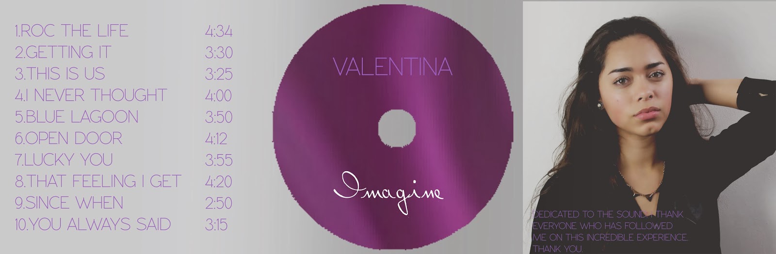
Final Digipak
Our group decided to go seperate ways for this one...
For my first draft of this exercise I think i've done a pretty good job
I've tried to follow the codes and conventions of a digipak from our Pop genre.
I've also taken into consideration the colourscheme which I think has gone really well. As Rita Ora used a Red font on her album Ora, I tried to steer away from that and go with something subtle yet girly. Pink for me just wasn't right, as I thought it looked slightly tacky, and obvious. I went for a subtle purple/lilac that I think compliments the grey, yet can still be seen. I might make the tone a bit more vibrant...
 |
| Back |
A Small Change


Choosing A Record Label
I had my eyes set on Parlophone Records for a while, as I had researched a tad into it during the summer whilst picking our song choices to get copyright clearance for. Parlophone records has a slightly more wide variety of artists, some are Indie and some are a bit more Pop. What I liked about this label is that whilst it is still independant, it has signed the likes of Tinie Tempah, Eliza Doolittle and Conor Maynard, which are well known slightly new and current artists, so what better way than to promote ours?

Sticking To The Colour Scheme
So as I religiously want to stick to the colour scheme, I devised a way to be able to do just that, without having to find specific logos that already come in white. I know this is probably the easiest thing in the world, but I had to take a little credit for the extra bit of effort...
Wednesday, 8 January 2014
Costume for Ancillary

Advertisment for Music Album

Monday, 16 December 2013
Digipak Fonts
I found this AMAZING website called dafont.com
It literally has the biggest range of fonts for every single occasion you could think of. It felt like christmas :') searching for the perfect font was pretty hard, as there were so many to choose from...
All the fonts on this website were free, there's even fonts that have been used on other artists albums.

I know minimalism is everything, less is more, keep it simple, and so on...
So I set my eyes on the 'basic' column, from there I could choose from:
San Serif
Serif
Fixed Width
Various
So I chose various because I was feeling lucky, over 30 pages of fonts came up.. Now was the tricky part. Which one?!
Sunday, 15 December 2013
Album Covers Analysis
In order to get an idea of what our target audience wants from a digipack, I looked online to see what album covers have been used to promote artists within the same genre as ours. Firstly starting with Rita Ora's album Ora, which was released in 2012 and was her debut album.
What we can note about these two is that the deluxe album(right)has the same picture, just a teeny bit smaller, and also that the writing and stylized decor is gold. The gold writing is emphasised by the fact it is the Deluxe album, this gives the audience a bit more to focus on, and for bigger fans to feel a bigger connection to the artist.
In our Do's of creating a successful digipack, we were also told the colour scheme should be kept to the maximum of 3 colours, as it could look tacky and overwhelming. The strong point about this album cover is that the picture itself of the artist, even though it is black and white, has a lot of depth to it due to shadows and highlights. The designers have then imposed the vibrant red(or gold)writing with a bold font. As it is a debut album, the artists name is usually always the main focus, apart from the artist herself.
 This is the cover art for Rihanna's album Unapologetic. This simple mid shot of her over a white background suffices as the designers have incorporated stylized editing to show the album name, and also other words that resemble graffiti that may be links to lyrics in her featured songs. The colour palette is again simple, black and white writing.
 This is Katy Perry's debut album cover One of the Boys. As we can note, again, her face and body are the main subject, as she is placed directly in the middle. They have also enhanced the colours but have kept to pastel like colours for the fonts and have given it a bubbly font, which could represent the type of music that would be on there.


What we can note about these two is that the deluxe album(right)has the same picture, just a teeny bit smaller, and also that the writing and stylized decor is gold. The gold writing is emphasised by the fact it is the Deluxe album, this gives the audience a bit more to focus on, and for bigger fans to feel a bigger connection to the artist.
In our Do's of creating a successful digipack, we were also told the colour scheme should be kept to the maximum of 3 colours, as it could look tacky and overwhelming. The strong point about this album cover is that the picture itself of the artist, even though it is black and white, has a lot of depth to it due to shadows and highlights. The designers have then imposed the vibrant red(or gold)writing with a bold font. As it is a debut album, the artists name is usually always the main focus, apart from the artist herself.
 This is the cover art for Rihanna's album Unapologetic. This simple mid shot of her over a white background suffices as the designers have incorporated stylized editing to show the album name, and also other words that resemble graffiti that may be links to lyrics in her featured songs. The colour palette is again simple, black and white writing.This is Katy Perry's debut album cover One of the Boys. As we can note, again, her face and body are the main subject, as she is placed directly in the middle. They have also enhanced the colours but have kept to pastel like colours for the fonts and have given it a bubbly font, which could represent the type of music that would be on there.
Saturday, 14 December 2013
Flickr Images
Here are some photos that I've just uploaded to Flickr, a photo website that shares your photos, or somewhere to store your photos :) We took lots and lots, to ensure we had high quality, good lighting and good angled shots. From these I then narrowed it down to my couple favourite, then I chose which ones would be suitable for what part of the digipak and advertisement. 
Friday, 13 December 2013
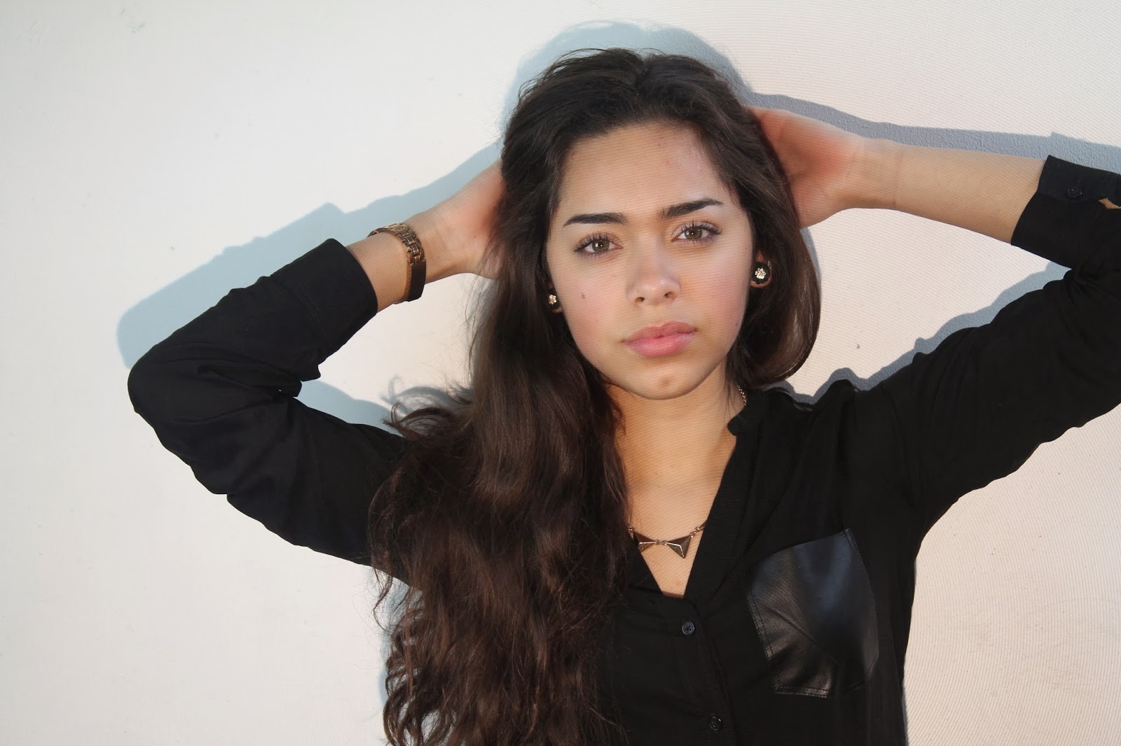
Photoshoot for Digipack
We took a series of photos of me on a plain white background, this way if we wanted something different in the back it would be easier to photoshop a realistic looking setting, even though we do like the white background.
As you can note we have kept the poses simple and the artists face is always the main focus of the picture as we have researched into Pop albums and they all use the artists face as the main subject.


As you can note we have kept the poses simple and the artists face is always the main focus of the picture as we have researched into Pop albums and they all use the artists face as the main subject.


Tuesday, 10 December 2013


Thursday, 5 December 2013

Subscribe to:
Posts (Atom)