For my first draft of this exercise I think i've done a pretty good job
I've tried to follow the codes and conventions of a digipak from our Pop genre.
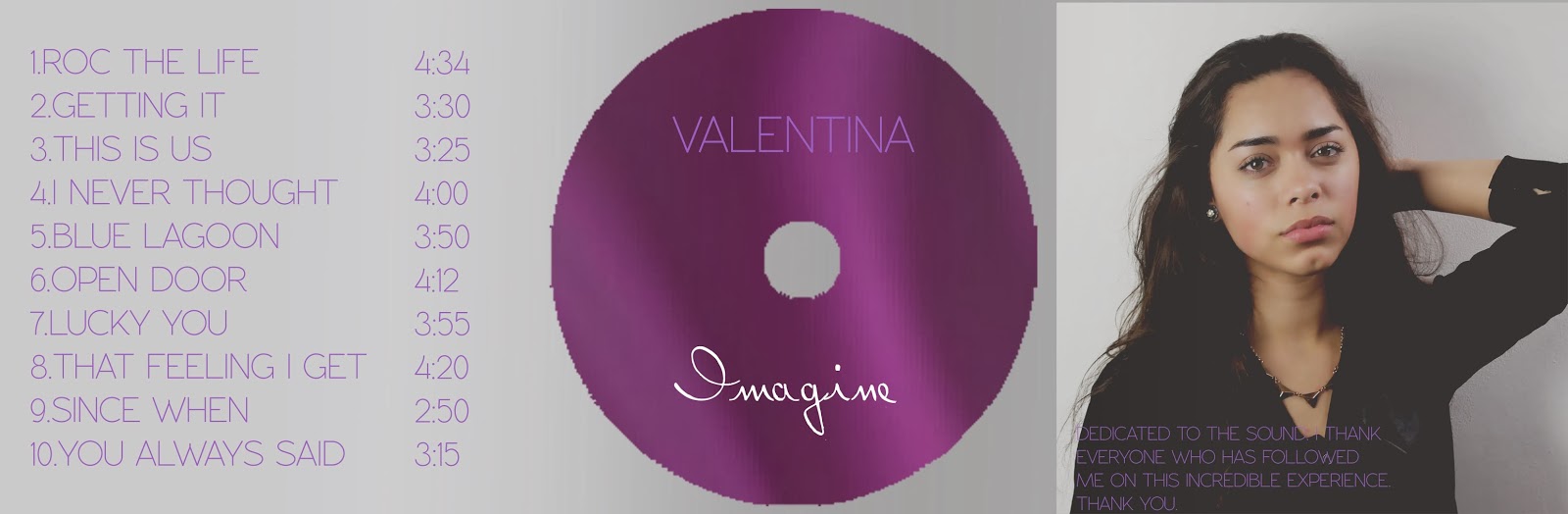
I've also taken into consideration the colourscheme which I think has gone really well. As Rita Ora used a Red font on her album Ora, I tried to steer away from that and go with something subtle yet girly. Pink for me just wasn't right, as I thought it looked slightly tacky, and obvious. I went for a subtle purple/lilac that I think compliments the grey, yet can still be seen. I might make the tone a bit more vibrant...

 |
| Back |
No comments:
Post a Comment