Anyways, here I am, talking about some stuff that I enjoyed during the year... And some other things :)
Friday, 24 January 2014
FINAL BLOG! Progress Review
Ugh. Its that time of the year again... Moving on from the cool, teen scene to the long hard hours of studying for exams (yay!!)
Anyways, here I am, talking about some stuff that I enjoyed during the year... And some other things :)
Anyways, here I am, talking about some stuff that I enjoyed during the year... And some other things :)
Ideas for Evaluation Q.1
-Andrew Goodwins Theory
Amplification, Illustration and Disjunction: Which one did we try to feature in our video? Did we show it well? Did we use it at all or did we go against these theories?
Must remember, our video was artist based.
Laura Mulvey's theory - Dismemberment and the 'Male Gaze': Did we challenge the conventions of a Pop/ R'n'B music video, or did we 'sexualise' our artist?
- We used mainly close up head shots to present the artist, so the target audience could familiarise themselves.
- We also used full length shots, to show outfits.
Visual aspects such as clothing and styling (makeup), why is our video different?
- Minimal makeup, or very natural looking makeup will allow our target audience, young girls, to not only look up to our artist but to see her as one of them, they can relate to her in her visual aspects and they will be able to build a relationship.
Ancillary products - How does what I have said before relate to this? Does it also counter Mulvey's theory, or does it show a more attractive side to the artist.
Guess Im done
Well this the the end of me blogging and I'm pretty sure i promised cats at one point so here some are.

Promise Fulfilled
GL & HF Ashley.


Promise Fulfilled
GL & HF Ashley.
Thursday, 23 January 2014
Evaluation Question 1
09. Giselle, Javayl, Ashley from 283goswell on Vimeo. (Video 1)
(Video 2)
(Video 3)
(Video 4)
(Video 5)
(Video 6)
Evaluation Question 4
Getting feedback after the cinema screening was crucial to seeing what my target audience thought about the video. This feedback was good but it may have been biased because although the people giving the feedback were in the target audience for my video, they were also people that i knew and may have given good feedback regardless. When the video was screened in the cinema we got a good response from the audience and lots of positive feedback meaning that our video was well recieved. I looked at the feedback that i got after the video was shown and I found that some of the feedback was very general for example, people saying "it was good" " it was really really good" but others focused on the locations and how we decided to use different locations. Someone also gave me some feedback that i was unable to record and said that the use of filming from daytime to night time was good and gave the video some continuity as well as leading in with the lyrics. but altogether the feedback was mainly positive and it would have maybe been helpful to get some critical feedback so I could see what needed improving and what I could change. I also got some feedback on my ancillary work but i was unable to upload any footage of it. people had varying opinions about it such as "it looks well designed" the feedback wasn't all good as one person said that it didn't look professional and it looks like a students work
Evaulation Question 4
Taken from these opinions I have learned from my feed back that I should check the focus on the camera when taking each shot as using a different camera it may have different settings that will be distinguishable in the final edit. The transitions could also be a bit smoother instead of cutting to a different scene we could have perhaps cut to a different shot on the same scene more. This would have made the video much more professional looking. Also looking at the shot by the river the lighting their was good we could have gotten up earlier to take shots of other locations when it was brighter. Right now it was a mix of evening, night and day shots, The transition to night wasn't as clean as we would had hoped and is something we need to look out for while editing next time. Other than our music video apparently being "really really good" people said that thy thought our artist put on a nice performance, luckily she was able to hide the fact that she was extremely cold singing without a coat in the middle of December. We as a group thought that in some of the scenes, mostly the locations we recorded first or where there is a lot of people, our artist didn't have as much confidence you could see this by looking the the amount of times she looks away at the camera to see if people were watching. Overall I think that although the reviews of our music video went well there was a few areas in which we fell behind and have room for improvement.
Evaluation Question.4
Here I am demonstrating Feedback from our target audience. I showed them both my video and I got responses for that, and then showed one of them my ancillary work.
From both girls I got very good responses, they both enjoyed the music video and gave me positive feedback such as the visual aspects of the artist. Therefore I was pleased with the choices my group had made with that, so the outfits and makeup worked together in forming an artist that was going to attract our target audience.
I also asked about any improvements we could make and I got good critique on our location changes, and that we should try to not focus on only one area of London, but possibly widen our possibilities to make a more enjoyable video.
These two videos are from the cinema screening. This is some feedback we got and the reactions to seeing it on the screen.
Tuesday, 21 January 2014


Thursday, 16 January 2014
Tuesday, 14 January 2014
Music Genre Conventions
Genre:
Bright Colours

Artist are often happy and upbeat in their videos often showing brighter ideals rather than showing depressing ideas.
Most of the time pop videos are about love or having confidence in ones self as the main target audience is teenagers and theses ideas are usually associated.
A Pop music video can be identified by the costume and location.
Costumes in pop videos are usually revealing and show alot of skin. The outfits that are worn are 90% of the time to bold to be worn in public, or are the newest style of clothing.
Monday, 13 January 2014

Final Digipak
Our group decided to go seperate ways for this one...
For my first draft of this exercise I think i've done a pretty good job
I've tried to follow the codes and conventions of a digipak from our Pop genre.
I've also taken into consideration the colourscheme which I think has gone really well. As Rita Ora used a Red font on her album Ora, I tried to steer away from that and go with something subtle yet girly. Pink for me just wasn't right, as I thought it looked slightly tacky, and obvious. I went for a subtle purple/lilac that I think compliments the grey, yet can still be seen. I might make the tone a bit more vibrant...
 |
| Back |
A Small Change


Choosing A Record Label
I had my eyes set on Parlophone Records for a while, as I had researched a tad into it during the summer whilst picking our song choices to get copyright clearance for. Parlophone records has a slightly more wide variety of artists, some are Indie and some are a bit more Pop. What I liked about this label is that whilst it is still independant, it has signed the likes of Tinie Tempah, Eliza Doolittle and Conor Maynard, which are well known slightly new and current artists, so what better way than to promote ours?

Sticking To The Colour Scheme
So as I religiously want to stick to the colour scheme, I devised a way to be able to do just that, without having to find specific logos that already come in white. I know this is probably the easiest thing in the world, but I had to take a little credit for the extra bit of effort...
Choosing a Record Label
I did quite a bit of research when looking for a record label that would be suitable for a new and upcoming british artist. I finally settled with GUT Records because it is an independant record label. I found this label while looking at british artists and seeing which labels they started off at. This is the Record label that first signed Jessie J and because she is a british artist and she makes music in the pop genre I decided that it would be the perfect fit for Valentina.
| GUT Recordings Logo |
Wednesday, 8 January 2014
Costume for Ancillary

Advertisment for Music Album

Tuesday, 7 January 2014


Home Drive
I recently got a Home Drive that can store all my work privately, now I dont need to save my work on a hard drive with two other people. I feel that now it is faster to get and save my work as before we would have to share a hard drive which isn't very good as sometimes you cant work without the hard drive plugged into your computer.
However now we are able to access our home drive from any mac in the department.


However now we are able to access our home drive from any mac in the department.
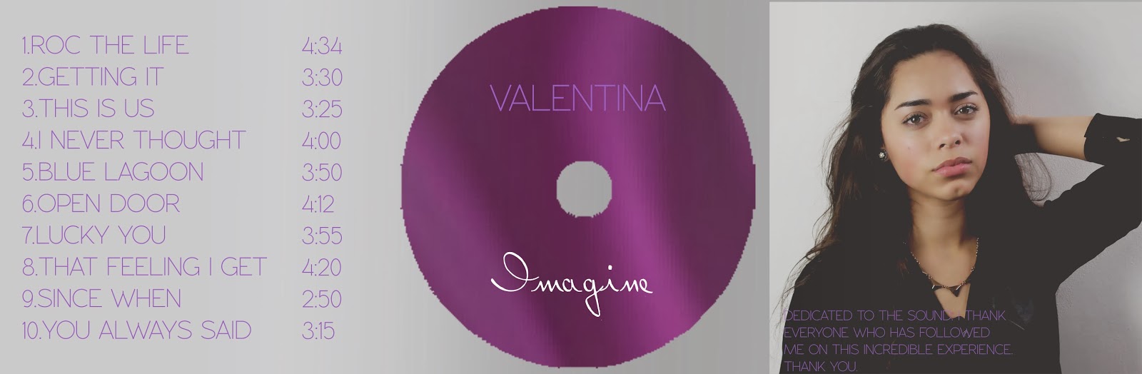
Final Ancillary Images

V1: I decided to go for a grey scale
for the digipak this way I could keep the background and not cut the artist out
of the original image, doing this allowed me to keep the shadows which I feel
makes the image look more genuine. I used the same colour for the spine as the
main text such as album title and tracks; I used the colour for the vine images
on the background to keep consistency. I feel that I should have used a picture
with the artist looking forward instead of looking down as I’m trying to introduce
the artist in the album cover. The track titles could also be placed closer to
the centre of the back of the digipak. The barcode could be better sized, as it
looks stretched. The back of the digipak looks off, as it doesn’t have any
gradient or shadows compared to the front.

V1: The positioning of the text and
picture was way off, I think being left handed I tend to move everything to the
left a lot more than i should, I got rid of the HMV and iTunes announcement as I
felt that it wasn’t relevant. The Artist name and Album name was the same size
so i decided to change that. I centred the text near the album cover and
changed the font type for the text. The background ended up having a small line
where it was white so I fixed that.

V2: I added the artists website and the record lables website. I swapped the position as im dumb and most people read from left to right to having most of the text on the right made no sense. I used a bold font that is easily readable, I lines up the text with the album cover as well. I also felt that I should add the vines that i had on the digipak as the ad was every empty and didn't seem related to the digipak.

V3: This is my final ad i changes the position of the the album cover to be more centred and remove most of the empty space that was in the middle. I also added logos from soundcloud itunes and a QR code.


Subscribe to:
Comments (Atom)